| ||||
Client NewsIn this blog we cover general internet news, trends, and how-to's of interest to our clients.
Recent Entries
«Return to Main Blog PageMobile and You -- Part 3: How Does My Current Website Look on a Mobile Device? March 4, 2015
At about this time in this series, you're probably starting to wonder if you need a mobile website. To figure out an answer, probably the first question you would have is "What does my website look like on a mobile device. If it looks and functions well, then maybe I don't need to do anything, but if it doesn't...." One simple way to find out how your website looks on a mobile device is to look at it on your mobile web browser. Let's start with our own site -- Hudson Valley Music (HVmusic.com) is a regional website showcasing the music of this region, covering the area from Albany to Queens, and including Hudson, Woodstock, Saugerties, Kingston, Poughkeepsie, Newburgh, Beacon. Let's look at it the way a web browser sees it...
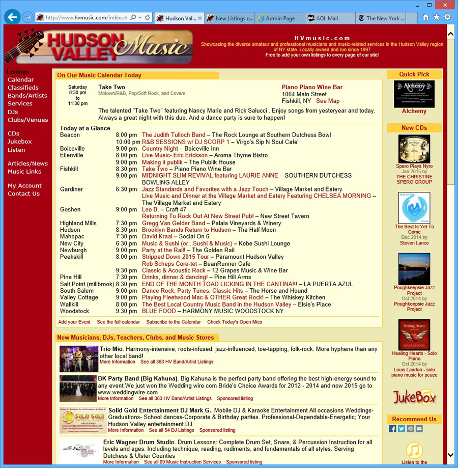 HVmusic.com on a web browser. This image has been scaled slightly smaller that actual size. HVmusic.com on a web browser. This image has been scaled slightly smaller that actual size.Now let's try it on a mobile device. 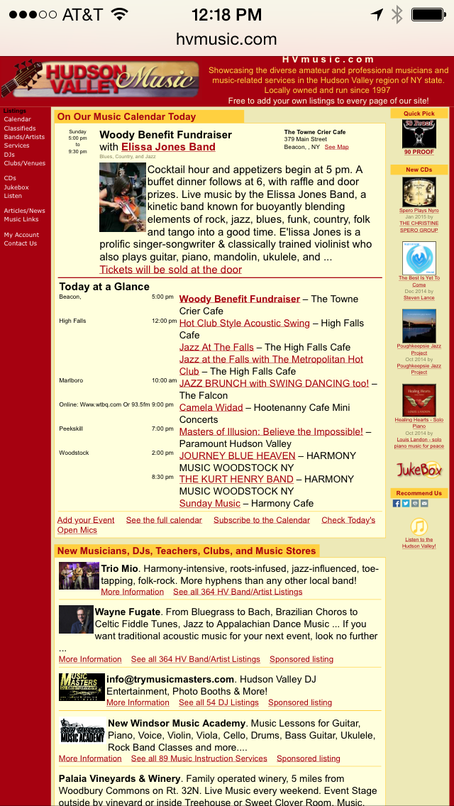 HVmusic.com on my iPhone HVmusic.com on my iPhoneHmmm... well, that doesn't look too good, does it. What the smart phone has done is taken the normal width of the website and shrunk it so that it would fit on the screen. Notice the navigation links in the upper left, they are so small and close together that they are unusable, unless you have very tiny fingers. (Please note that I wrote this blog entry before I had reworked the HVmusic.com website to work on mobile devices. If you actually look at HVmusic.com on a mobile device it looks great now, but when I wrote this it looked like the examples on this page) How about a tablet? Let's look at the site on a tablet... 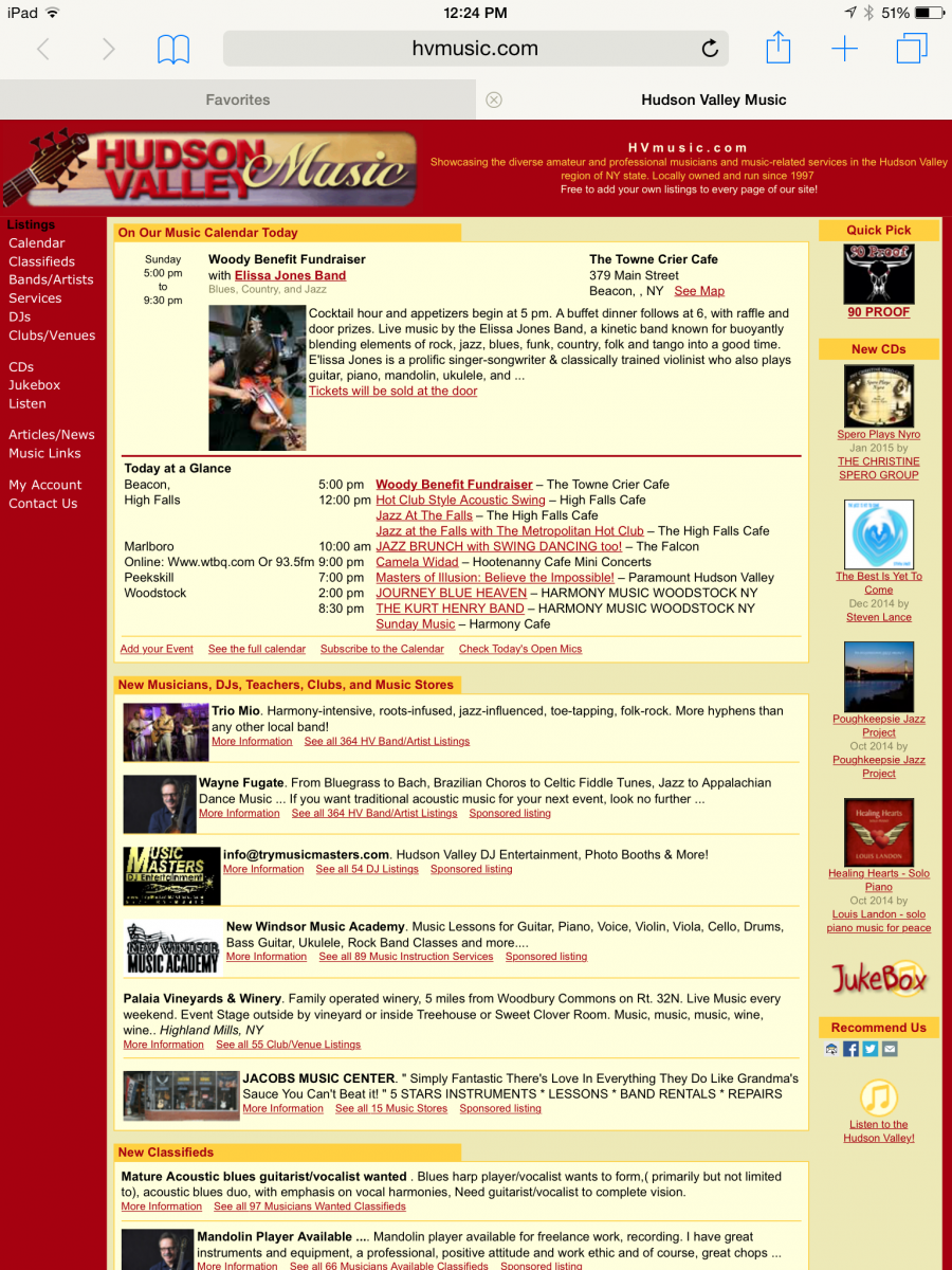 HVmusic.com on my iPad. I have scaled this image to be proportional with the two above. HVmusic.com on my iPad. I have scaled this image to be proportional with the two above.Not bad. Again, the iPad has scaled the site down so that it would fit on the screen. But since the iPad screen is quite large, this scaling doesn't do nearly the amount of damage to readability that it does on the iPhone. In my opinion the site it still quite usable on a tablet. Try this on your own website and see how it looks on mobile devices. Note that you can rotate the screen on your mobile devices from portrait to landscape orientation (turn it on it's side) and your website will look bigger.
Let's look at some other websites to see what they look like on mobile devices. Let's try the NY Times... 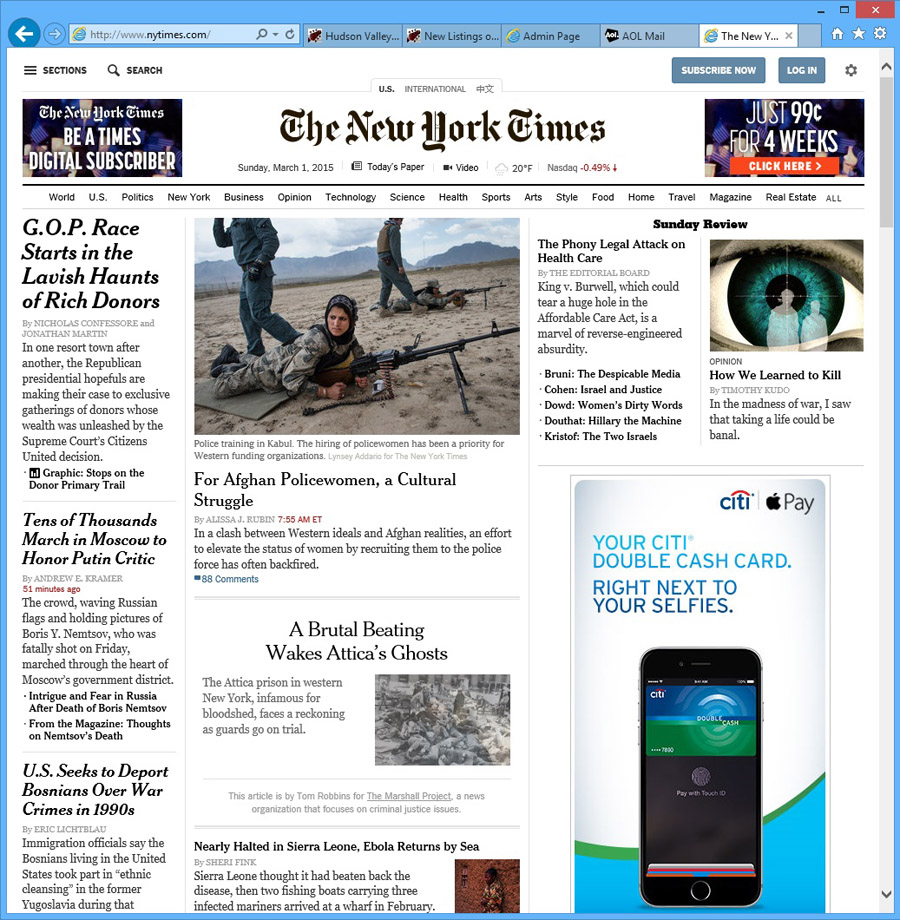 NYtimes.com on my web browser. Again, I have scaled it down slightly to fit on this blog page. NYtimes.com on my web browser. Again, I have scaled it down slightly to fit on this blog page.Now let's look at the NYtimes on a tablet and smart phone... 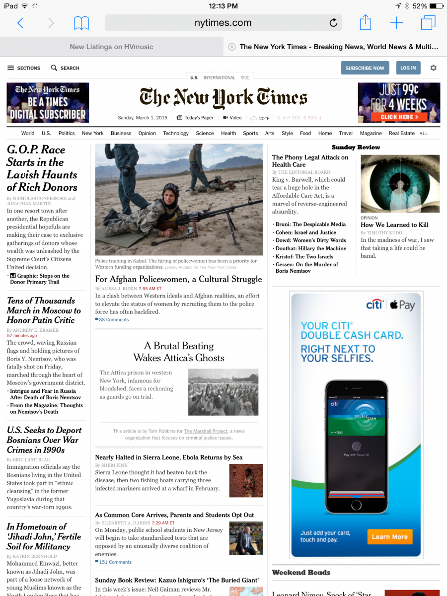 NYtimes.com on my iPad NYtimes.com on my iPad NYtimes.com on my iPhone NYtimes.com on my iPhoneNotice that the tablet version is identical to the full browser version, just slightly scaled down to fit on the tablet. But... what's up with the iPhone version? It looks completely different. What the times has done here is to create a unique mobile-only version of their website specifically tailored for smart phones. This version has very readable type, hidden navigation, and big buttons that are easy to press with our big fingers on a small screen. This is what a mobile website looks like! Notice some unique features of the mobile web site...
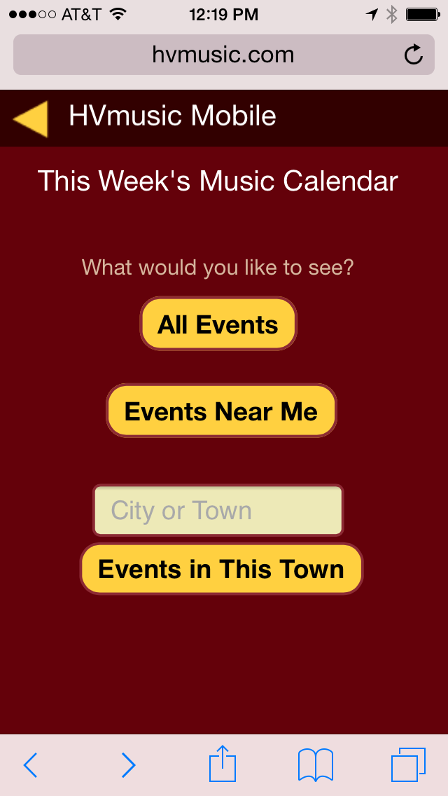
We have developed a mobile website for HVmusic too. It does not show all the information that is available on the desktop version of the site, in fact it shows only a small portion, but is much more user-friendly on mobile devices. Take a look...
Notice how this mobile site follows the three principles above -- simplified design, large fonts, compressed navigation. Also notice some of the cool things you can do in a mobile website -- like find "Events near me". Wrapping up. So I hope this gives you a better understanding of how websites look and function when viewed on mobile devices. To summarize:
Continue Reading Part 4 -- Do you need a mobile website?
| ||||
|
 HVmusic mobile calendar
 HVmusic mobile calendar